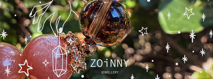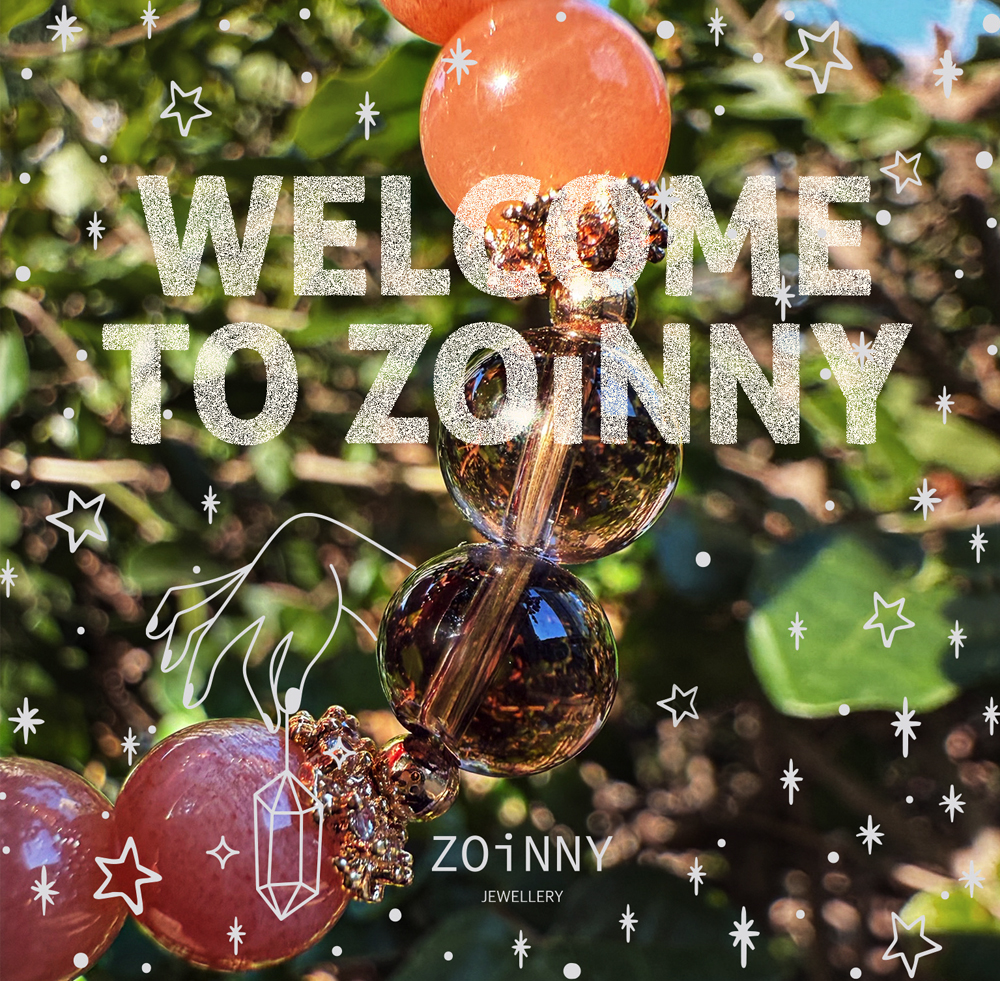
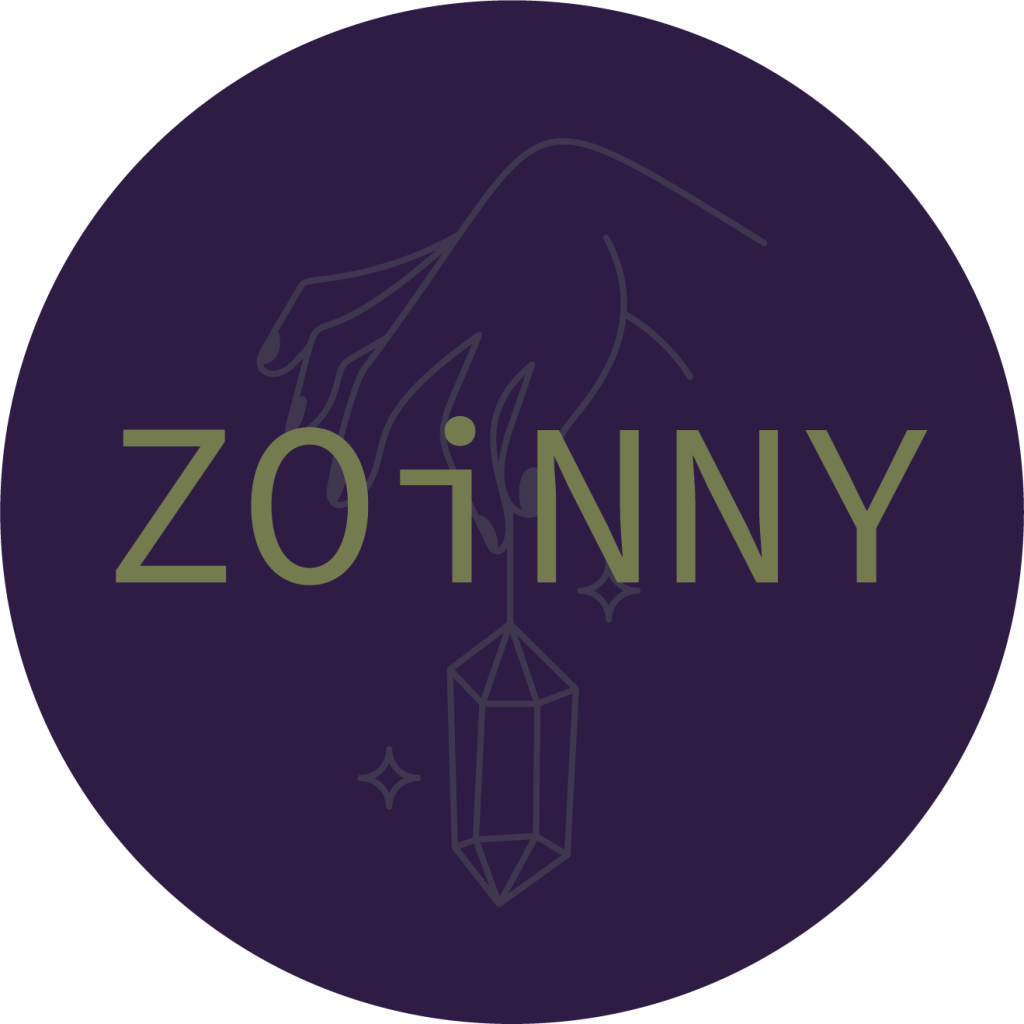
ZOiNNY is a Hong Kong/ UK brand specialising in handmade natural crystal bead bracelets. Its core colours—purple and green—are drawn from Amethyst and Green Phantom, the founders’ birthstones, symbolising mystery, elegance, and personal connection. The overall identity was designed to feel refined yet approachable, with a stylish, girly sweetness that sets the brand apart.
The logo explores two directions: a simple “ZY” monogram and a hand-with-crystal illustration, both versatile across print and digital use. Typography combines the clean, modern feel of Source Code Variable with the softer curves of Teen Regular, creating a balance between elegance and contemporary freshness. Together, they express both the mystical energy of crystals and the youthful, welcoming spirit of the brand.
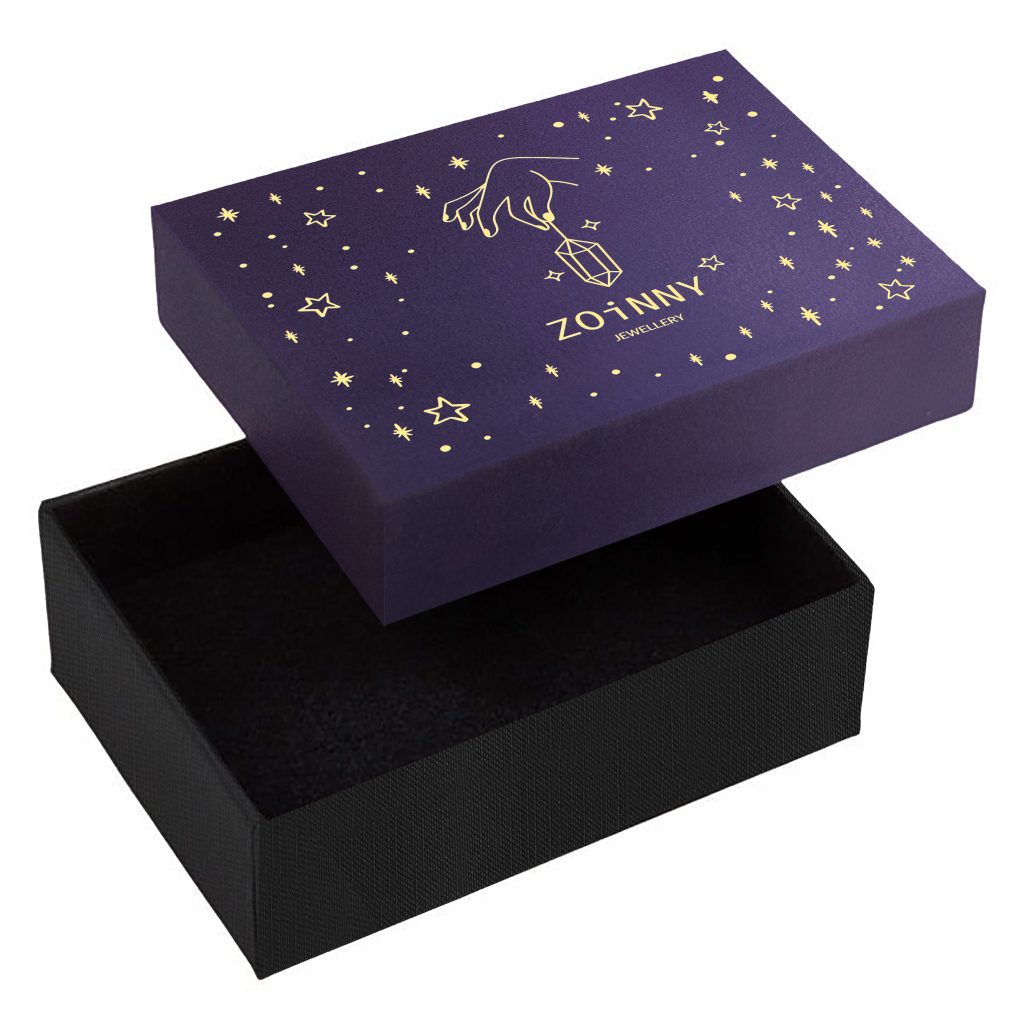
The ZOiNNY bracelet box pairs a deep amethyst purple lid with gold foil detailing, reflecting the brand’s crystal-inspired elegance and mystery. A delicate hand-and-crystal motif, framed by star illustrations, creates a sense of luxury and wonder. Clean, modern typography balances with soft curves, while the black textured base grounds the design in sophistication.
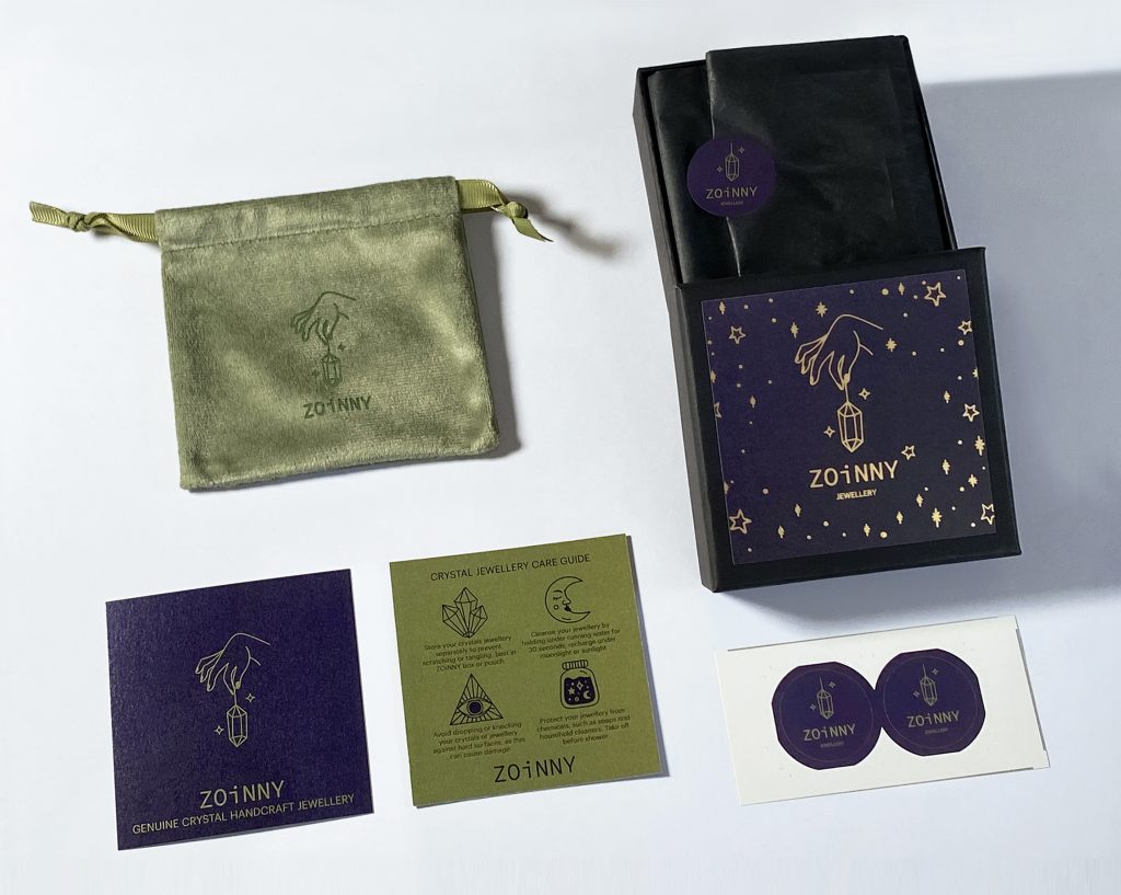
I developed the full packaging suite—including two options of box, dust bag, sticker, and user card—alongside brand visuals and social media graphics, ensuring a cohesive and memorable brand experience from unboxing to digital presence.
This is an ongoing project, with upcoming work on social media assets to extend the brand’s visual identity across digital platforms. (2025)